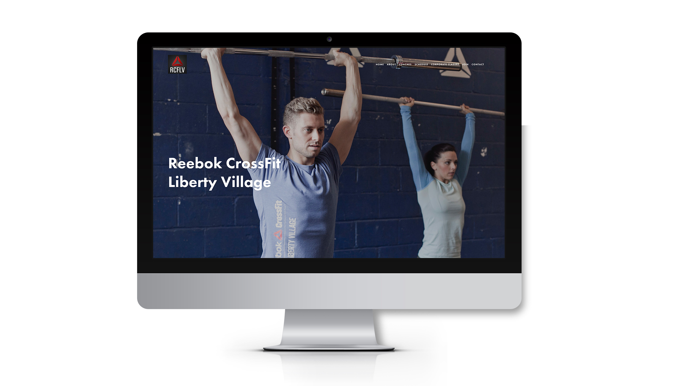
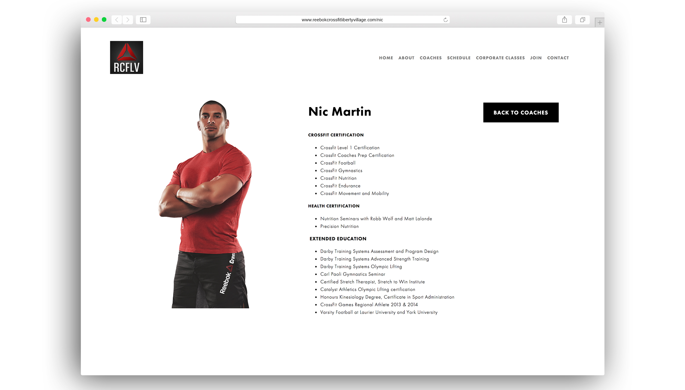
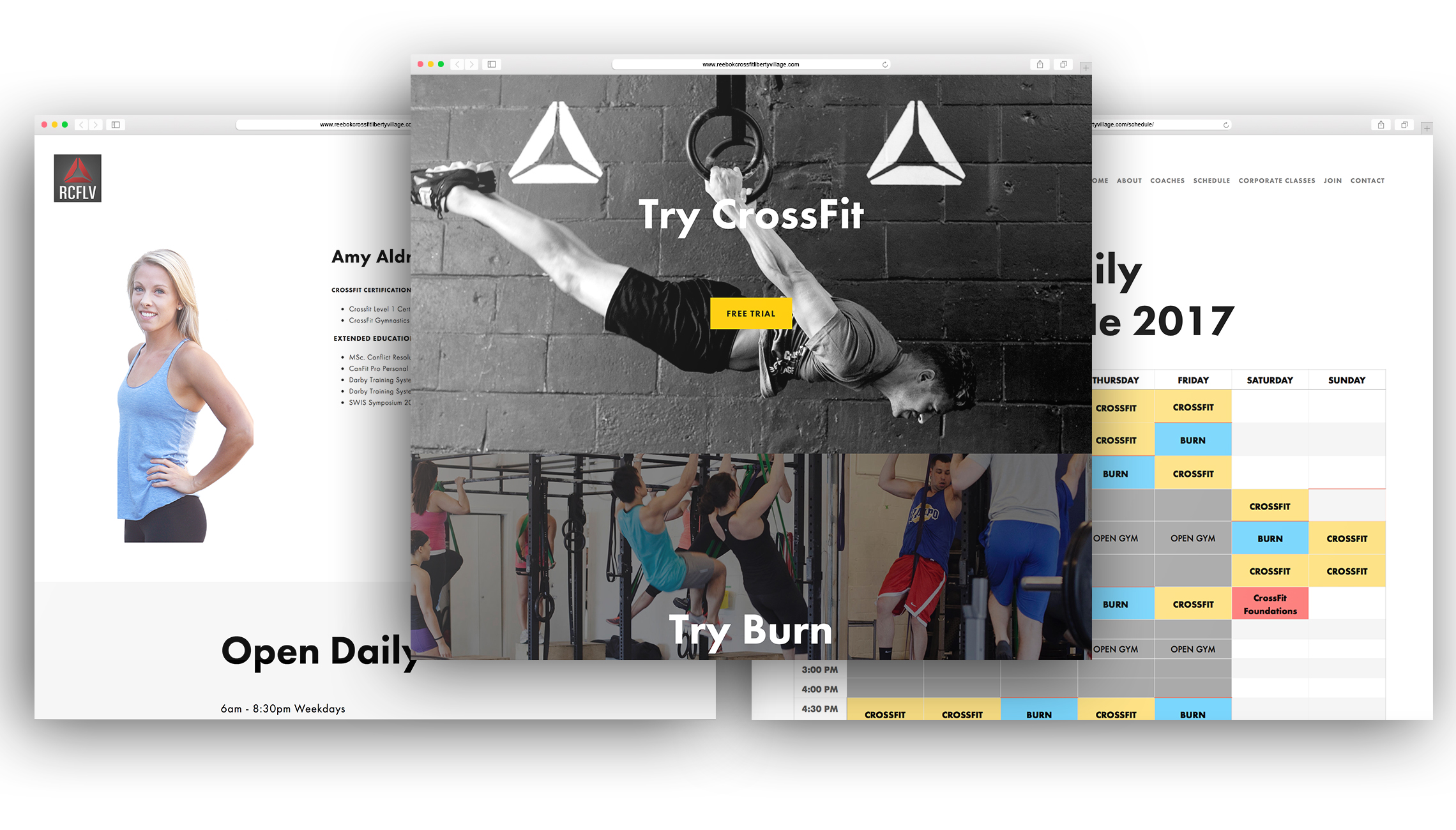
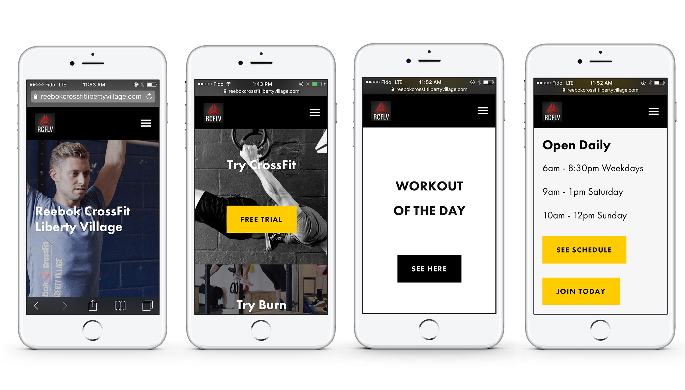
A re-design was intended to increase sign-ups as well as to easily navigate customers to their sign-in portal. The previous design had no effective calls-to-actions, which was an important feature that Reebok required to drive sales. The new website had to be an accurate representation of the brand. By simplifying the website's navigation and design, we created a new site that was a great presentation of the brand, was responsible, and mobile optomized.


